Difficulty by design

Good design is all about making things easier, right? Simplifying the complicated? Well, it depends. One instance where this doesn’t hold true is edtech.
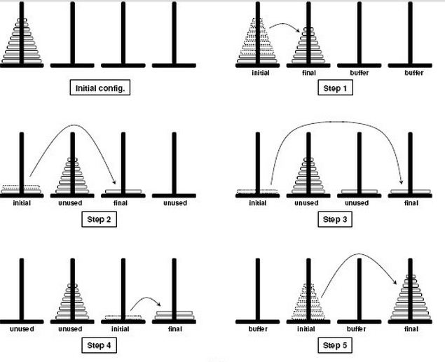
My favourite example of this is a paper by Gunnvald Svendsen called “The influence of interface design on problem solving” [pdf]. Svendsen showed that study participants who tried to solve the Tower of Hanoi problem using a more cumbersome command-line interface were able to learn the principles governing the solution better than participants who tried to solve the problem using an easier direct manipulation interface.
It goes beyond edtech. The idea of “desirable difficulties” extends into education more broadly speaking:
“In fact, when teachers try to facilitate learning by making it as easy as possible, this may increase the immediately observable short-term performance, but it decreases the more important long-term retention.”
That’s not an excuse for crappy edtech (or teaching). But it’s a reason to search for empirically supported instances of difficulties that are desirable because they produce superior learning results, and then to implement those difficulties in edtech (and in the classsroom).
Because of the short-term user performance/satisfaction hit, it takes some nerve to implement desired difficulty. It’s like the plutonium of design, one wrong step and you’ve long-term pissed off your users – so you have to be careful with this stuff! The promise of good results followed by their realization is what provides the confidence to use desired difficulty.
